R as a set of statistical tables
One convenient use of R is to provide a comprehensive set of statistical tables. Functions are provided to evaluate the cumulative distribution function P(X ≤ x), the probability density function and the quantile function (given q, the smallest x such that P(X ≤ x) > q), and to simulate from the distribution.
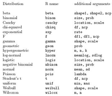
Prefix the name given here by ‘d’ for the density, ‘p’ for the CDF, ‘q’ for the quantile function and ‘r’ for simulation (random deviates). The first argument is x for dxxx, q for pxxx, p for qxxx and n for rxxx (except for rhyper and rwilcox, for which it is nn). The non-centrality parameter ncp is currently only available for the CDFs, most pdfs and a few other cases: see the on-line help for details.
The pxxx and qxxx functions all have logical arguments lower.tail and log.p and the dxxx ones have log. This allows, e.g., getting the cumulative (or “integrated”) hazard function, H(t) = −log(1 − F(t)), by
- pxxx(t, ..., lower.tail = FALSE, log.p = TRUE)
or more accurate log-likelihoods (by dxxx(..., log = TRUE)), directly.
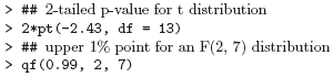
In addition there are functions ptukey and qtukey for the distribution of the studentized range of samples from a normal distribution. Here are some examples
Examining the distribution of a set of data
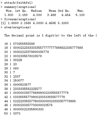
Given a (univariate) set of data we can examine its distribution in a large number of ways. The simplest is to examine the numbers. Two slightly different summaries are given by summary and fivenum and a display of the numbers by stem (a “stem and leaf” plot).
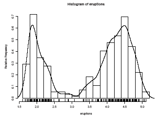
A stem-and-leaf plot is like a histogram, and R has a function hist to plot histograms.
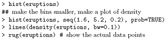
More elegant density plots can be made by density, and we added a line produced by density in this example. The bandwidth bw was chosen by trial-and-error as the default gives too much smoothing (it usually does for “interesting” densities). (Better automated methods of bandwidth choice are available, and in this example bw = "SJ" gives a good result.)
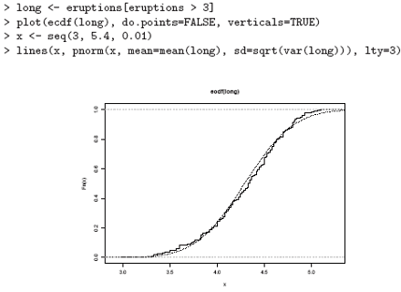
We can plot the empirical cumulative distribution function by using the function ecdf.
> plot(ecdf(eruptions), do.points=FALSE, verticals=TRUE)
This distribution is obviously far from any standard distribution. How about the right-hand mode, say eruptions of longer than 3 minutes? Let us fit a normal distribution and overlay the fitted CDF.
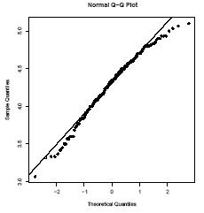
Quantile-quantile (Q-Q) plots can help us examine this more carefully.
par(pty="s") # arrange for a square figure region
qqnorm(long); qqline(long)
which shows a reasonable fit but a shorter right tail than one would expect from a normal distribution. Let us compare this with some simulated data from a t distribution
x <- rt(250, df = 5)
qqnorm(x); qqline(x)
which will usually (if it is a random sample) show longer tails than expected for a normal. We can make a Q-Q plot against the generating distribution by
qqplot(qt(ppoints(250), df = 5), x, xlab = "Q-Q plot for t dsn")
qqline(x)
Finally, we might want a more formal test of agreement with normality (or not). R provides the Shapiro-Wilk test
> shapiro.test(long)
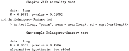
(Note that the distribution theory is not valid here as we have estimated the parameters of the normal distribution from the same sample.)
Next: One- and two-sample tests
Summary: Index