Home >
Doc >
Volatility and Structure: Building Blocks of Classical Chart Pattern Analysis > Screening Examples
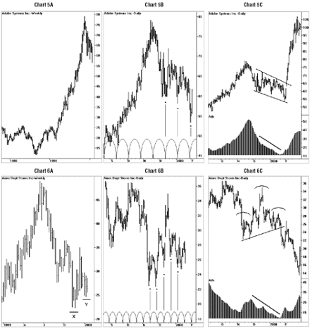
In this section I will present several examples of how the model components combine to facilitate chart pattern based trading decisions. Chart 5A, a weekly chart of Adobe, shows that the stock rallied strongly from a low of about 15 dollars in mid 1998 to a high of about 75 dollars in late 1999. Note the characteristic cycle structure during this trending phase; there is almost no overlap between adjacent cycles except for a brief consolidation during the early part of 1999.
However, starting in mid November 1999, Adobe begins to retrace some of its gains. Upon closer examination of the daily chart during this phase (Chart 5B) we see an overlapping cycle structure and a distinct 18-19 day cycle periodicity. Thus the action in Adobe satisfies the basic requirements of the structure component of the model. Rather than attempt to attribute various meanings to the “shape” of this pattern, we are simply looking for generic behavior that is consistent with the model. Yet we are not ready to trade this pattern until we can satisfy the requirement of the volatility component of the model. In Chart 5C, we can see how relatively higher volatility, as denoted by ADX levels between 30 and 50 during the final months of 1999, coincided with a] the ending stages of the prior up-trend and b] the beginning stages of the chart pattern’s development.
Note also how decreasing volatility, as depicted by gradually declining ADX levels, marked the late and final stages of chart pattern development. It is common to see ADX levels decline into the sub-20 level immediately prior to the completion of a chart pattern, just prior to a pattern “breakout,” as Adobe demonstrates in January 2000. By waiting for the market to indicate through a measurable decrease in relative volatility its readiness to breakout, and by ignoring the directional implications of specific chart pattern “shapes,” we do not find ourselves engaged in the tricky game of constantly anticipating the time of the breakout or its direction.
Chart 6A is a weekly chart of Ames Department Stores, showing prices in a steep downtrend from mid June through November 1999. During this time Ames lost about fifty-percent of its value. Note the rally attempt in November beginning from point X on the chart, and the slight pullback in December to point Y. At this stage, on the heels of a multi-month decline in prices, a chartist might normally be pondering whether this current pattern represents a “higher low” or some other popular formation indicative of the early stages of a reversal.
However, since we are only concerned with whether and to what extent the pattern imitates the model, we do not refer to specific bull, bear or pattern “shapes.” A closer look at the daily chart (Chart 6B) shows that Ames has established a distinct 10-11 day cycle periodicity with clearly overlapping waves. Finally, in January of 2000, the stock breaks down through support near 25 dollars (Chart 6C).
Note how this pattern breakout follows a decrease in relative volatility, as denoted by the ADX indicator declining into the sub-20 level. Through an awareness of the conditions that precede pattern breakouts, we are less likely to enter a position based on a premature or “false” move outside of the pattern. We are waiting for the market to tell us when it is ready to move, rather than imputing our own biases to the pattern.
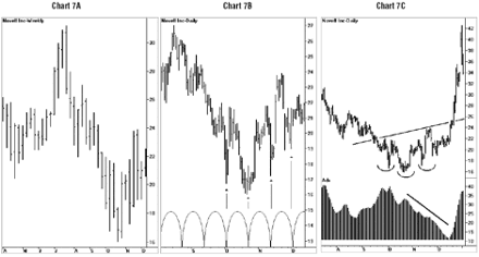
 Lastly, Chart 7A shows a weekly chart of software maker Novell,
with prices falling steadily from mid-July through October 1999.
Not unlike in the previous example of Ames Department Stores,
Novell loses roughly fifty-percent of its value over a multi-month
period. Beginning in October, a period of consolidation occurs in
which a distinct 14-15 day cycle emerges (Chart 7B).
Lastly, Chart 7A shows a weekly chart of software maker Novell,
with prices falling steadily from mid-July through October 1999.
Not unlike in the previous example of Ames Department Stores,
Novell loses roughly fifty-percent of its value over a multi-month
period. Beginning in October, a period of consolidation occurs in
which a distinct 14-15 day cycle emerges (Chart 7B).
By mid-December, ADX has declined to sub-20 levels, a point at which we have normally come to expect a breakout (Chart 7C). Although I have highlighted the detail around this pattern to simulate a classically styled “complex” or “irregular” head-and-shoulders bottom reversal, this was done purely in hindsight. The point is that such interpretations are open to wide debate; no doubt many technicians could have found different “classical” patterns in the chart prior to the upside resolution of prices in Novell in December 1999.
By Daniel L. Chesler, CMT, CTA
Next: Final Thoughts
Summary: Index