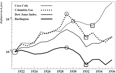
Fig.1 Course of the price for three stocks versus Dow Jones Index. The prices are yearly highs. During the bull market 1921-1929, the prices of Coca Cola and Columbia Gas (an utility company) have increased faster and more than the DJ average, while the price of Burlington Northern (a railroad company) has increased slower and less than the DJ. The circles and squares show the peaks and troughs respectively. The resilience pattern reveals itself in the fact that when a peak is above (or below) the DJ average the same situation prevails for the trough. Sources: Common stock price histories (log supplement); Dow Jones Investor’s handbook (1972).
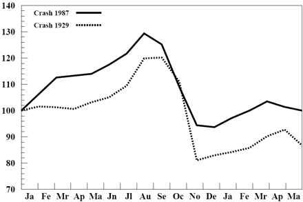
Fig.2 Parallel between the crashes of 1929 and 1987. Monthly prices. During the 8 months before and after the crash the behavior of the Dow Jones Index was very much the same in both cases; as one knows the subsequent evolution was very different however. This suggests that crashes and long-lasting slides are two distinct (and not necessarily related) phenomena. Sources: The Dow Jones averages 1885-1970; OECD main economic indicators (1969-1988).
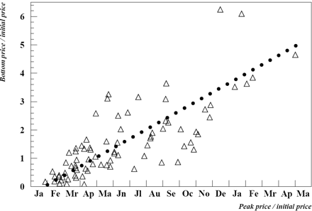
Fig.3 NYSE, 1921-1932 peak: distribution of 85 sample points in the (A,B) plane. Each triangle corresponds to a stock; the prices are yearly highs. Dotted line: linear regression (correlation is 0.87). Source: Common stock price histories (log supplement).
By Dr B.M. Roehner
Summary: Index