Market Dynamics Learn Relative Strength Point & Figure Charting
The Spirit of Technical Analysis
Region of serious under-performance
Extreme volatility - Shortest time period
High performance bullish support lines Example 1-2
High performance bullish support lines Example 3-4
High performance bullish support lines Example 5-6
High performance bullish support lines Example 7-8
High performance bullish support lines Example 9-10
Resistance below the bearish resistance line
Major long-term trends Example 1-2
Major long-term trends Example 3-4
Major long-term trends Example 5
Major long-term uptrends Example 1-2
Major long-term uptrends Example 3-4
Major long-term uptrends Example 5
Some thoughts about how the market works
Some thoughts about portfolio management
Relative strength study - real time - uptrends and downtrend lists published by WCA in 1999

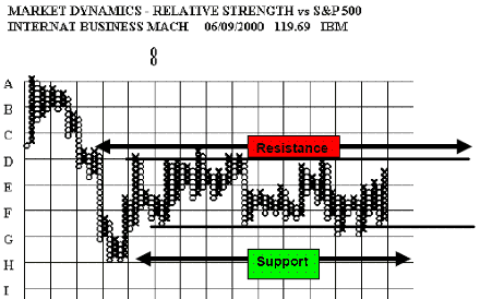
A study of the distribution of the returns from common stocks suggests that most stocks are in a trading range most of the time (i.e. 20% in the negative tail, 20% in the positive tail and 60% in the narrow middle of the distribution)
The trending stocks are in the two tails and the balance is moving back and forth with the market. In the absence of an upside breakout the shares of most major, mature companies should be sold as they approach the high end of the historic trading range. This is also a good reason why the relative strength point and figure charts need to be long-term in perspective. Trading ranges are very common on the relative strength point and figure
charts.
By W. Clay Allen CFA

Charting and Technical Analysis
This document explained like using the Technical Analisys applied to the Point & Figure Charting By W. Clay Allen CFA