CHANGE LANGUAGE | Home > Technical Analisys Beginner > Learn Relative Strength Point & Figure Charting > Region of serious under-performance

Market Dynamics Learn Relative Strength Point & Figure Charting

The Spirit of Technical Analysis

Chart construction and layout

Region of Excess Return

Region of serious under-performance

Extreme volatility - Shortest time period

Analysis of trends

Triple top buy signal

Triple bottom sell signal

45 degree lines- Bullish

High performance bullish support lines Example 1-2

High performance bullish support lines Example 3-4

High performance bullish support lines Example 5-6

High performance bullish support lines Example 7-8

High performance bullish support lines Example 9-10

Support and resistance

Resistance below the bearish resistance line

Trading ranges

Channels

Major long-term trends Example 1-2

Major long-term trends Example 3-4

Major long-term trends Example 5

Major long-term uptrends Example 1-2

Major long-term uptrends Example 3-4

Major long-term uptrends Example 5

Major long-term down-trends

Natural trendlines

Major reversal patterns

Major bases

Breakouts Example 1-2

Breakouts Example 3-4

Breakouts Example 5-6

Breakouts Example 7

Some thoughts about how the market works

Theory of Runs

Some thoughts about portfolio management

Relative strength study - real time - uptrends and downtrend lists published by WCA in 1999

Learn Relative Strength Point & Figure Charting

Region of serious under-performance

Unacceptable performance

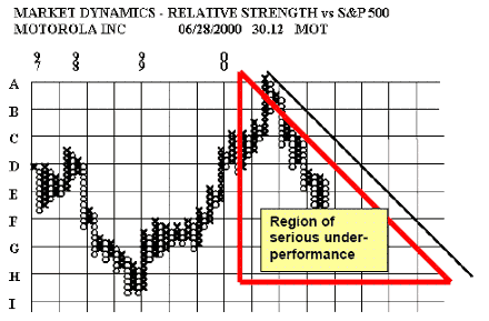
When the relative strength starts to fall below the 45-degree bearish resistance line the under-performance has become serious. Portfolio managers should be reluctant to hold/purchase any stock that is moving back and forth below the bearish resistance line. In my opinion, signals are not as important as the position of the stock relative to the bullish support lines and the bearish resistance lines.

Stocks that undergo serious long-term fundamental deterioration will remain below the bearish resistance line for many months.

Time period covered – all charts are programmed to cover four years of history. Volatility effects how much time the chart covers.

Low volatility – Long time period

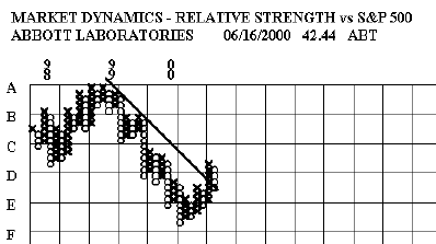
The chart on ABT covers less than half the graph and yet it covers almost three full
years of relative strength movement. The fluctuations of the stock relative to the market were fairly modest indicating low risk even though the stock declined for over a year relative to the market.

High volatility - Intermediate time period

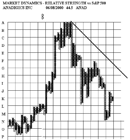
An example of high but not extreme volatility. The time period is almost a year.


PerformanceTrading.it ed il suo contenuto sono di esclusiva proprietà degli autori. E' vietata la riproduzione anche parziale di qualsiasi parte del sito senza autorizzazione, compresa la grafica e il layout. Prima della consultazione del sito leggere il disclaimer nella sezione [info].