Market Dynamics Learn Relative Strength Point & Figure Charting
The Spirit of Technical Analysis
Region of serious under-performance
Extreme volatility - Shortest time period
High performance bullish support lines Example 1-2
High performance bullish support lines Example 3-4
High performance bullish support lines Example 5-6
High performance bullish support lines Example 7-8
High performance bullish support lines Example 9-10
Resistance below the bearish resistance line
Major long-term trends Example 1-2
Major long-term trends Example 3-4
Major long-term trends Example 5
Major long-term uptrends Example 1-2
Major long-term uptrends Example 3-4
Major long-term uptrends Example 5
Some thoughts about how the market works
Some thoughts about portfolio management
Relative strength study - real time - uptrends and downtrend lists published by WCA in 1999
example 1

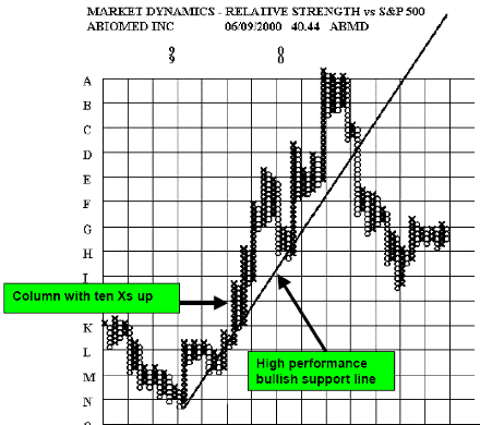
Stocks that start to move up dramatically on the relative strength charts like this will appear on the Market Dynamics one-month high RS screen, the triple top buy signals screen and often on the ten box up screen. The increasing relative strength is an indication they are moving out into the positive tail of the distribution. They should have broken out above almost all-historic resistance and the up trend should be accelerating. Trend following tools work best on stocks like this. These stocks have the potential to become big winners. They are easily identified early in their moves with the screens supplied by Market Dynamics.
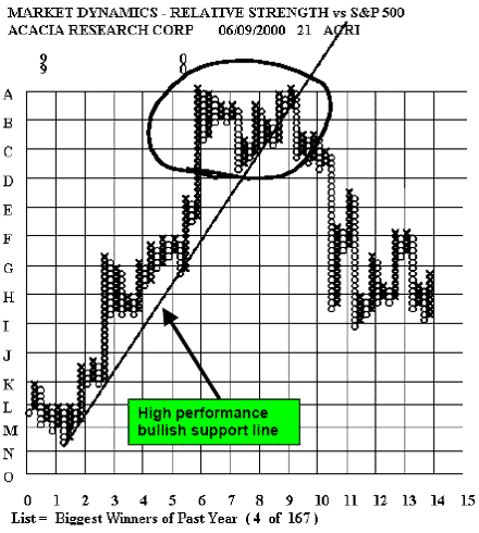
example 2

By W. Clay Allen CFA

Charting and Technical Analysis
This document explained like using the Technical Analisys applied to the Point & Figure Charting By W. Clay Allen CFA