Ratio chart – price relative to S&P 500
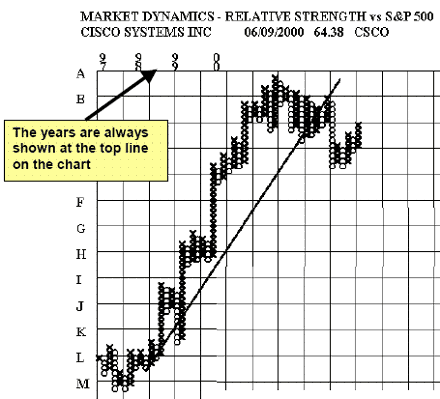
This is a long-term relative strength chart on CSCO. It covers almost four years of RS history. Relative strength is calculated by dividing the price of the stock by a major market index – i.e. the S&P 500. The ratio is then multiplied by a scaling factor (i.e. 1000). The P&F chart is plotted according to the rules pioneered by Chartcraft Inc. of Larchmont, New York. The daily highs and lows are used in the calculation of relative strength.
Since the chart is a plot of ratios - the movement relative to the market is what is being recorded. The ratios don’t mean anything in and of themselves. The letters along the Y-axis and the numerals along the X-axis are to be used only as reference points when discussing the charts. The grids on the Market Dynamics relative strength charts are square. This becomes important when using 45-degree bullish support lines and 45-degree
bearish resistance lines. It is important to note that the X-axis does not measure time.
The 3-box system is designed to show major trend movement relative to the market. The rising trends are recorded with a column of Xs and the declines with a column of Os.
It seems that the stock market (maybe all markets) exhibit this pattern of alternating periods of rise and fall in price. The three box - point and figure method of charting is designed to filter out the minor movements and concentrate attention on the long-term major movements in relative price. The long-term movements are always more important than the short-term noise and this system is designed to take advantage of that characteristic behavior.
X-axis – does not measure time –It records alternations of trend
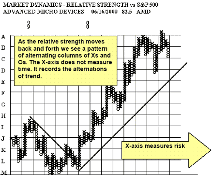
The alternations of trend are a direct function of volatility - so we can say that the X-axis is scaled in units of risk - since volatility is often thought of as a proxy for risk. The Y-axis is scaled in units of relative return. We are actually recording the movement of risk
versus return.
We should be gaining more in the Y direction than we are recording in the X direction if we are performing better than the market. The RS of the stock should remain above an upward sloping line if we are outperforming the market. Many times a 45-degree line that slopes upward to the right is used to gauge the performance of a stock. Above the 45-degree line is acceptable and below the 45- degree line is unacceptable. This ensures a margin of excess return - over and above the performance of the market. The slope is +1 for a bullish support line, which requires one box up for each box to the right. One unit of gain for each unit of risk.
W. Clay Allen CFA
Next: Region of Excess Return
Summary: Index